Naboso Sensory Sticks
- Content Production
- Media Planning & Management
- New Product Launch
- Product UI/UX Design
- Visual Identity Evolution
- Website Design & Development
What If…
We accelerated performance for a small startup
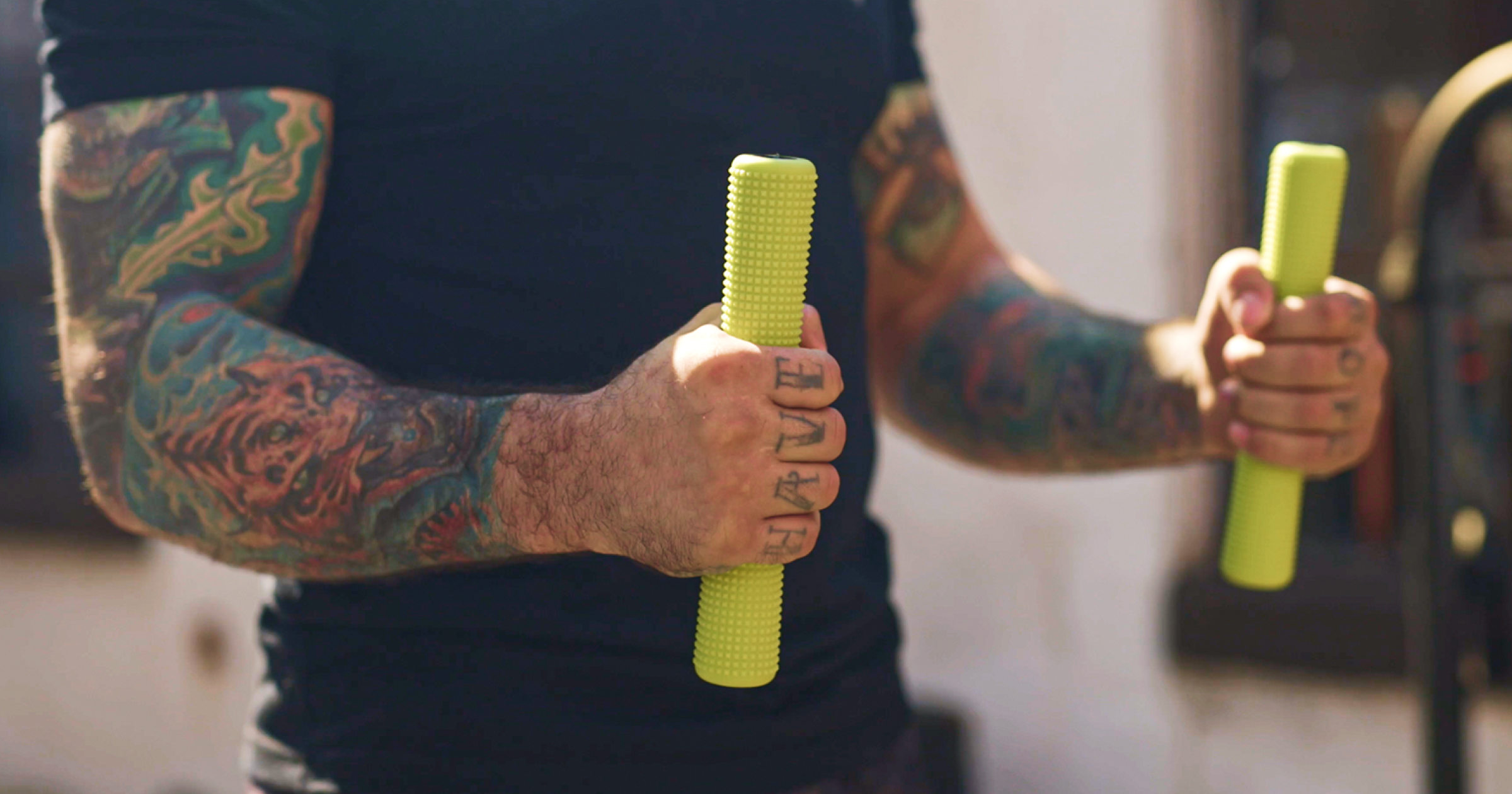
We believed we could go places no competition had gone yet, expanding the product line across a range of audiences and use cases. In this case, the new Naboso Sensory Stick was unlike anything in their lineup. For the first time ever they were manufacturing a sensory product specifically for hands. What if we could inspire people to grab on tight and join this brand journey?
We Did
Take hold of intense brand growth.
Our collaborative partnership with the team at Naboso led to a highly successful product launch that opened up an entirely new audience segment and revenue stream for the brand – highlighting a variety of use cases showing the versatility of the product while still maintaining and communicating the overarching benefits. A razor-sharp strategy paired with a groundswell of tactics including video production, a new digital experience, organic and paid media, and an unboxing experience allowed us to give consumers a brand experience that could put the Naboso story of sensory stimulation directly in the palm of their hands.
From product prototype to packaging concepts.
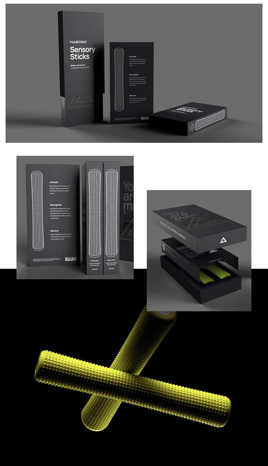
The design of the sensory sticks was both iterative and collaborative. Throughout the development of the product we were faced with several design decisions – Which texture density made sense and with which color? How heavy should the sticks be? How should they be branded? What finishes should the sticks have? With the idea that consumers would be ordering a pair of these to be delivered to their doorstep, we needed to conceptualize and produce a package that not only protected the sticks while holding them in place, but that could tolerate the weight of the sticks at just over 4 lbs.
An unboxing experience worth its weight in sensory sticks.
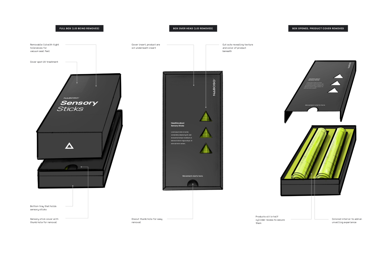
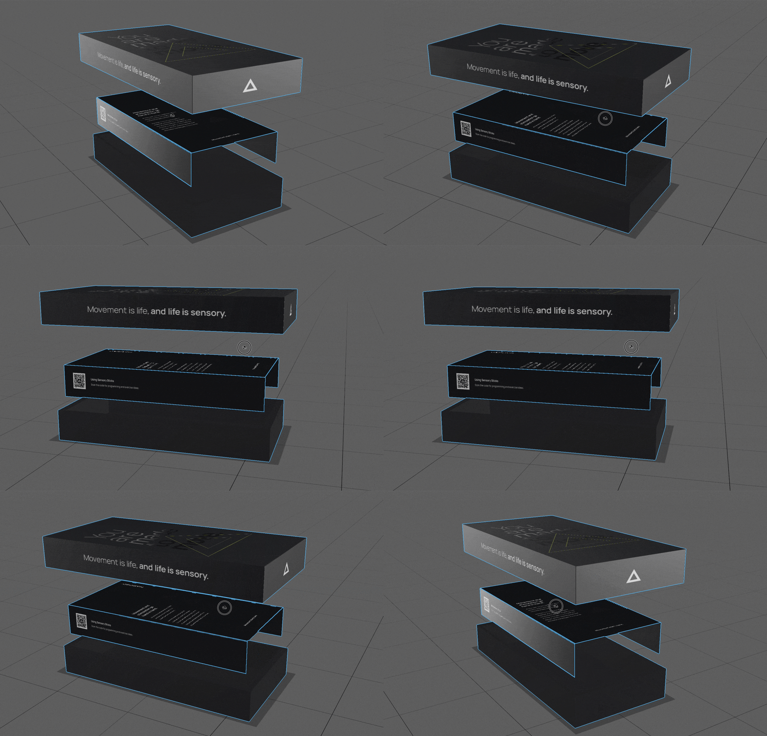
Working alongside the product manufacturer, we came up with a package solution that was both durable and pleasant for consumers to open. Since Sensory Sticks were an entirely new product for the brand, we wanted to ensure we were telling a story at each point of the unboxing experience. A sleeve holds a top lid and bottom base together firmly. When opened, consumers are greeted by an aspirational brand message printed as a spot UV layer. When the box is opened, the sticks sit in recessed cut outs revealing the texture through triangular cutouts. From the first moment you interact with the package, you’re given a sensory experience that carries through until you get the products in hand.
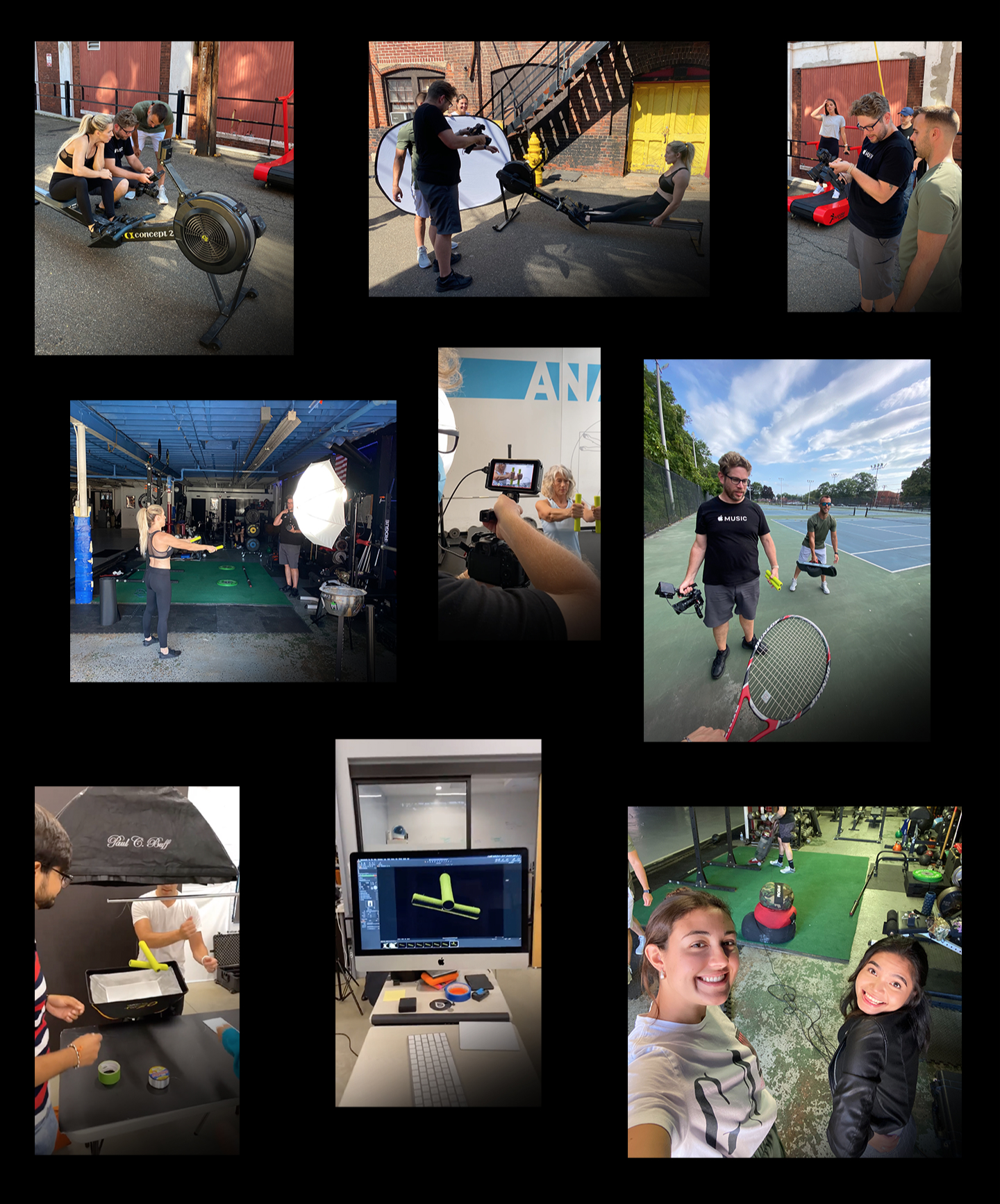
Package it, then shoot it: from onset to post production
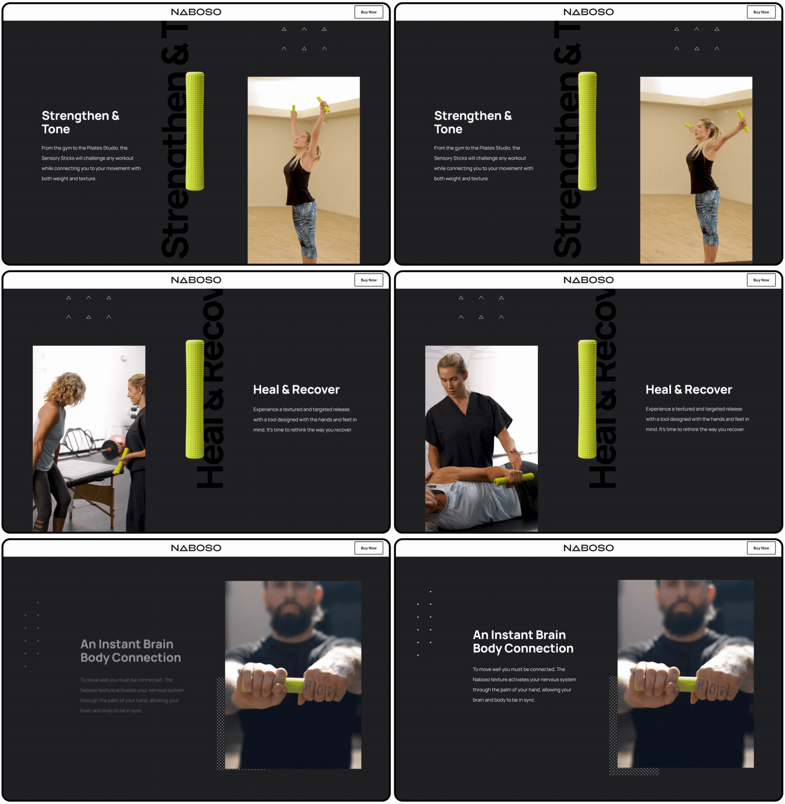
We nailed down product and packaging design, and now it was time to bring to life how the product is used. We cast a wide net with the launch of Sensory Sticks by ideating around a variety of use cases that were most appropriate and relevant. We broke down the approach into 3 main pillars: (1) Activation & Performance, (2) Strengthening & Toning, and lastly (3) Healing & Recovery. We decided to capture 3 distinctly different use cases to show the versatility of the product, and ensure our audiences knew what Sensory Sticks were all about.
Activation & Performance spoke to the aggressive gym go-er and weightlifter. Activating before any workout is important. Strengthening and Toning was all about speaking more to a body weight movement audience; those hitting yoga after work or hopping on their spin bike at home. Sensory Sticks make for a unique set of dumbbells that can challenge just about any workout. Healing & Recovery was more of a rehabilitative approach for those dealing with movement complications post-injury or surgery, or those dealing with motor issues as a result of something like a stroke. The sensory stimulation enables a brain:body connection, allowing those who are recovering to reconnect with their bodies. So, as part of the launch package we produced a handful of :15 spots to flood various media.
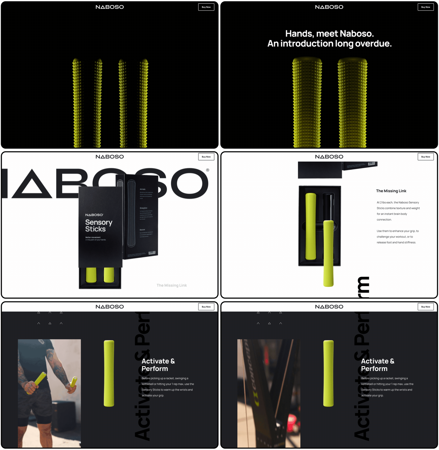
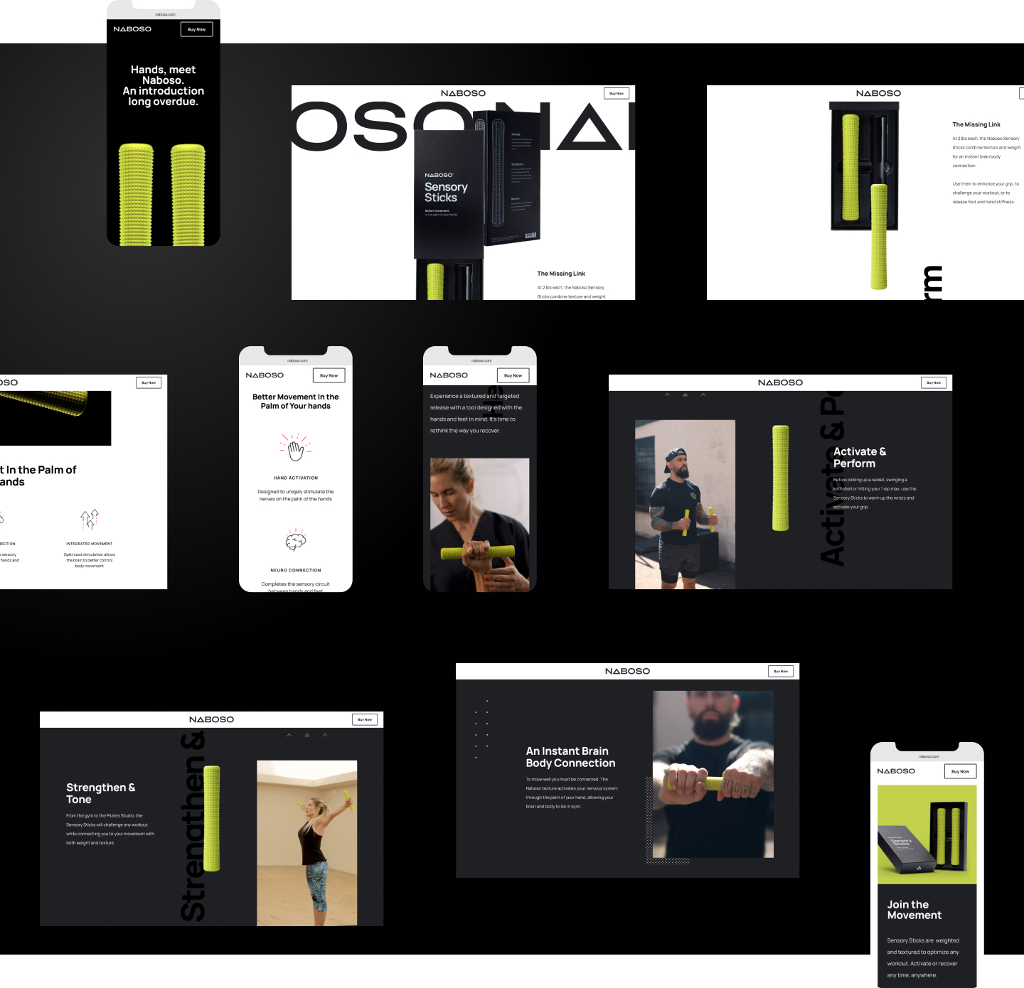
Product education integrated into a scroll experience.
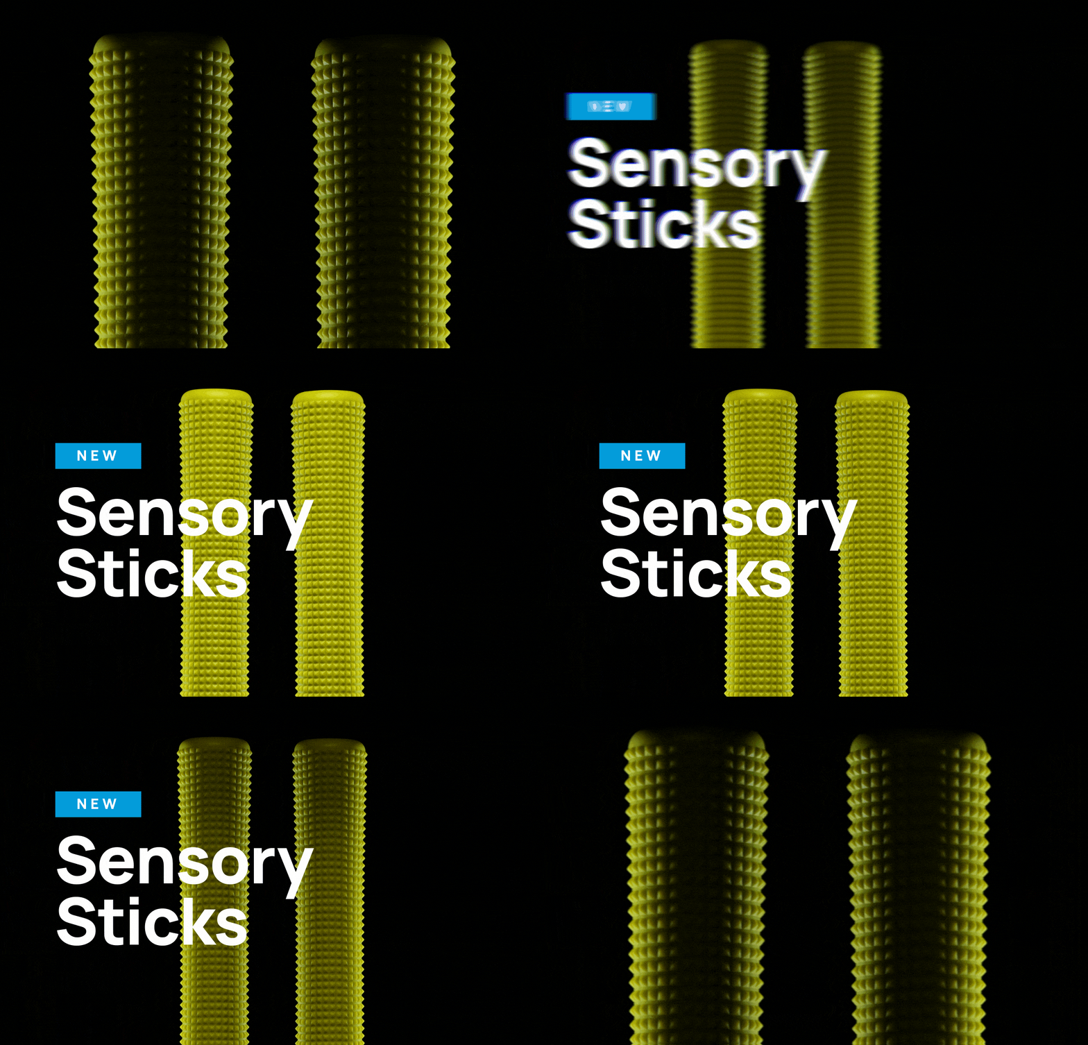
Sensory Sticks were an entirely new product from Naboso, targeting an area of the body Naboso products were not necessarily known to have a primary use for. So given that Sensory Sticks were positioned as a new activation and recovery tool, we had to ensure we were informing users and potential consumers what they were and how they are best used. Separate from the Shopify site we had already built for Naboso, we designed a landing page specific to Sticks narrowing the product focus and conversion funnel. From top to bottom the page was designed to introduce the product, show a variety of use cases, and explain the benefits of the product itself. Using animation and scroll, we made a meaningful experience for users to feel what sticks were all about without them having to have the product in hand. We led with the texture and used a story of use cases pointing them in a direction to purchase.
